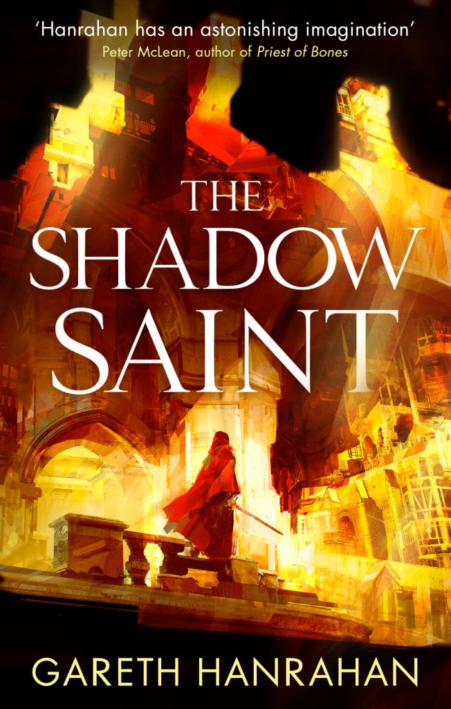
The cover for The Shadow Saint was revealed several months ago. That said, when I shared it on twitter again last week, it attracted many eyeballs, which is a good reminder that the internet never forgets but humans have a limited bandwidth, so let’s have another look at the lovely thing.
The original art notes I sent ran like this:
Foreground:A cloaked and hooded figure. As ambiguous as possible – no facial features, unclear if it’s male or female.
Optionally – a sword in hand. I’m wondering if it should be flaming – there’s a lot of fiery swords in the book, and it could be a dramatic light source for the cover.
Background:the New City. I’ve included way too many paragraphs of description from the books below, but the basic concept is that it’s a city that was miraculously conjured using the stolen power of a god. It’s all made of this divine pearly living stone, but it’s dreamlike, full of impossible architecture, and half-formed. I’ve included some art references in a moodboard.
Other Elements: Themes and bits in the book that might be referenced on the cover:
o Water – large parts of the action take place at sea or in the harbour. (I wonder about reusing the layout from the first book – the New City was created on top of part of the old city)
o Election posters – the novel takes place over the course of a general election, so there are posters everywhere.
o [SPOILER]
o Spiders. [SPOILER], so having a spider or web motif could be fun (a broken window, with a spider-web of cracks? A spidery shadow?)
I was also involved in another bit of art direction for The Shadow Saint, which I can’t talk about yet. More of that anon. However, I can talk about art direction more generally.
Roleplaying games have a lot of art, and it usually falls to the writer or line manager to do the art notes. An art notes document is a list of desired illustrations, giving specifications for each piece. On average, there’s a budget for about a 1/4 page of art every four pages (some books have a much higher art budget, and clever things can be done to reuse art or break up endless walls of text with design elements, but 1/4 page per four pages is the rule of thumb I’ve used for the average supplement). So, if I want a lovely full-page splash image at the start of a chapter, I’ve got to live with 15 art-free pages somewhere in the book.
The first step, then, is working out what art pieces are actually needed, as opposed to nice-to-have. The cover, obviously, is non-negotiable (and covers are a whole other series of blog posts). Internal art falls into four rough categories:
- Illustrations of specific scenes or elements
- Maps and handouts
- General Illustrations
- Signposts
Not every book will have all those types, and the ratio of types varies. Adventures are mostly specific scenes and maps/handouts; rules-heavy sections need more signposts.
Illustrations of specific elements are stuff like “here’s what this monster looks like” or “here’s what this weapon looks like”. For notes like that, I try to provide a reasonable level of detail, as the image is depicting a specific entity. I might copy in the relevant bits of the monster description. I might give photo references, if such things exist. Here, usually, the exact composition can be left up to the artist – if my monster is a six-armed gorilla with bug eyes, then it doesn’t really matter to me if the gorilla is swinging through the trees, or beating its chest, or menacing an adventurer . Whatever works best for the artist is usually fine. Art notes are one step in a collaboration – I don’t have the visual or artistic talent to know what the best image might be.
So, as an example from a recent project:
a shambling giant of a man – huge, hairy, greasy, his belly bloated. He stinks; a smell of rotten meat and leaf-mould and piss. He wears a filthy trenchcoat and has taken to wearing a battered, wide-brimmed hat. From a distance, he does a passable impression of Merlin or Gandalf; up close, when you can smell him, when you can see his piercing, unearthly eyes, you just want to get away from him. Beneath the trenchcoat, his increasing transformationis obvious. He’s compensated for the “coarse, loosely knit” flesh of the resurrected by melding himself with fungi and plant matter; he’s becoming more plant-like as he grows, and maintains his animal essence by devouring large amounts of raw meat.
That gives a workable description of the character in question, without specifying too much about pose, background, style or anything like that. The art notes must leave space for interpretation by the artist, while still meeting the requirements of the text.
Maps and handouts, when they’re included in the art notes, need to be right, although what “right” means depends on the context. A map of a city, for example, might require that locations A, B and C are all in the same district, and that C is close to the river because that’s what the plot demands, but as long as those conditions are met, everything else is flexible. As an example, look at the lovely maps for Cthulhu City.
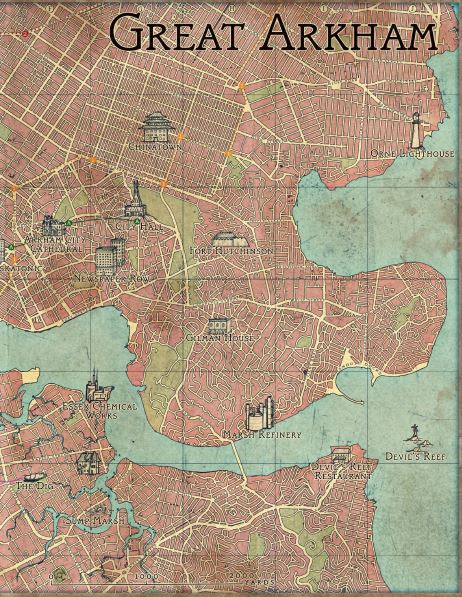
There, all I provided the artist was a list of location descriptions and a very very rough sketch map.
General Illustrations aren’t tied to a specific point in the text. An image of a particular monster is going to go next to that monster’s writeup, but an image of the player characters creeping through a dungeon could go almost anywhere in the description of the dungeon. General illustrations tend to be where the artist has the freest hand, as there’s no specific requirements associated with the piece. My notes for these sections tend to be very loose, even giving multiple options (“um, maybe the adventurers are sneaking up on the temple? Or examining a carving of a squid-dragon-monster-thing on the wall, unaware of the shadow of the actual squid-dragon-monster falling upon them…“) That said, unless you’ve worked with the artist in the past, it’s good to send along some general art notes about the intended look and feel of the book, along with any particular requirements for setting or composition.
Finally, Signposts are there to aid navigation. It’s good practice to have an illustration at the start of each chapter, and near sections that’ll be referenced repeatedly over the course of play, so someone flipping through the book can quickly find a particular page.
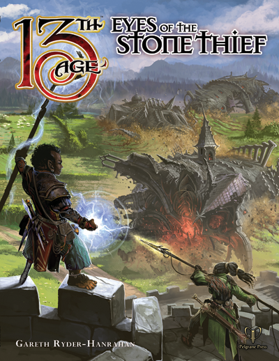
Some examples. Here are the art notes for the Eyes of the Stone Thief cover:
Cover:It’s at the moment that the Stone Thief swallows a castle. Our viewpoint is from the top of a collapsing tower. In the foreground, we’ve got a group of adventurers who were hunting the Stone Thief, and have now been caught by it. They’re toppling into the dungeon’s maw along with the tower. As the original inspiration for the campaign was Moby Dick, let’s be cute and refer to that book in the adventurer design.
· Adventurer 1: Halfing Male Wizard (Captain Ahab): Gaunt, burning eyes, dark hair. One of his legs is missing and has been replaced with an artificial peg-leg that could be made of bone or stone, but it’s definitely got magic runes engraved on it. He’s got a magic staff and is conjuring some dark sorcery to zap the dungeon.
· Adventurer 2: Human Female Ranger (Queequeg): Dark-skinned and tattooed, she’s got a spear or harpoon (or even a ballista – this dungeon’s a lot bigger than a whale) and is completely focused on throwing it even as everything collapses beneath her.
If we can fit more adventurers, cool, but I suspect those two will take up enough space. We can hint at more off to the side, perhaps.
Below and beneath these unlucky heroes, we can see bits of a castle falling into a huge chasm that’s spontaneously opened up beneath it. We can see corridor entrances, portcullises and other doors in the walls of the chasm, giving the impression of a vast and labyrinthine dungeon built in and around this sudden pit. I called it an Architectural Sarlacc on one occasion, but I was drunk at the time.
And the result. As you can see, the artist (Ben Wootten) perfectly captured the two characters I’d described, and did a wonderful job bringing the dungeon to life. He wisely ignored the stuff about the chasm and the castle collapsing to get a more coherent image, and one that works better as a cover – it’s the moment before everything goes to hell.
An internal illo:
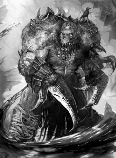
A titanic undead horror, made up from bits of lots of smaller undead horrors. There’s a human skull in the middle of it, but it’s running a body with bones taken from much larger, nastier creatures. Despite it all, there’s a weird symmetrical beauty to the monster – the Flesh Tailor considers itself to be an artist, so it’s sculpted itself the perfect form according to its insane aesthetics. (Part of the inspiration comes from the X-Men character Cameron Hodge, if you want to look online for references)
And the result. Again, it’s not quite what I thought it would be – in my head, there were a lot more bones – but the image is a great one, and more than suits the character.